I recently signed up to The Gap's newsletter to see how they're handling their email marketing.
I "Officially" opted into their list on Friday September 13th.
Things started off well but as we moved into the next week a different type of picture emerged.
By the time Friday the 20th hit (one week later) I was already burnt out from the amount of messages they had sent me.
Here's a look at my inbox...

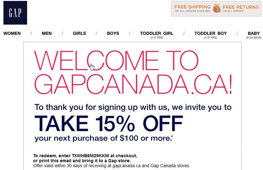
They started off strong. Welcoming me to their mailing list. The email looked good (you can see it below). They gave me a discount for becoming a subscriber and I could use it right away. I even liked their "Free Shipping" callout in the top right corner of their message.
I was pleasantly surprised. Things were off to a good start.
But that quickly changed to dread and overwhelm...
The Welcome Email
The welcome email from the Gap jumps right into the offer. Even their subject line showcases it - Subject: Welcome to Gap! Special Offer + FREE Shipping Every Day.
So what's the offer? Well you can see it for yourself below...
They took a couple of days off before they started to email me again. But when they did start up again with the promo offers they hit my inbox again and again and again.
It was just too much. Maybe if I was a Gap fanboy, or I had made a purchase from that first message, I could possiblly see why they were so aggressive when it came down to their email marketing.
But really?
Every single day?
I don't even talk to my own Mom that much (Hi Mom! I love you).
So by the time I received a message on Monday September 23rd I was done.
In a little over one week I was burnt out from their email marketing efforts. Which was too bad because I was super-excited to see what they were up to(and they started off pretty strong).
Trying To Unsubscribe
So I decided "enough was enough" it was time to unsubscribe from their newsletter.
I was a little surprised by this process as well.
There was no single click unsubscribe functionality. I was directed to a page so that I could click unsubscribe again. So I clicked unsubscribe again...and got...
An error message.

OK. OK. Maybe it was me.
So I tried to unsubscribe again. And again. And again. Still the same thing.
To give them the benefit of the doubt I signed up with another email address to test their unsubscribe functionality just to be sure...
Maybe it was me? It had to be me right?
Wrong...it was them.
Now don't get me wrong. No one's perfect. We all mess up. Processes fall apart, aren't tested properly and systems can malfunction.
I get that. As an online email marketing company we understand that better than anyone else.
But The Gap?
Additional Insights From the Gap's Email Marketing Strategy
I think there's a couple takeaways that we can learn from the Gap.
1st off it looks like the Gap takes email marketing pretty seriously as their opt-in box takes up 1/5 of their front page.
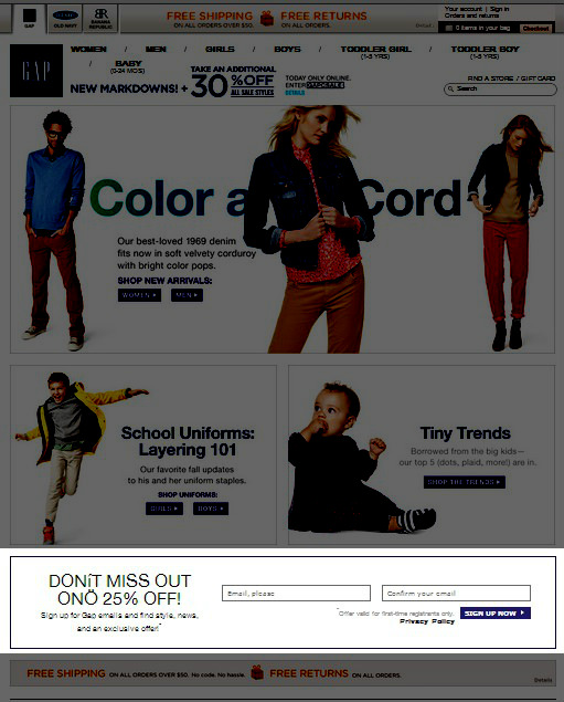
I'm not sure what's up lately but I've noticed that sites who've been using this font have been having surprise bonus characters pop into their copy. And the Gap seems not to be immune from the either as the their big call out should read, "Don't Miss Out On 25% Off!" (Just viewed the page using firefox and the font looks slick and modern without any weirdo characters showing up - I guess it's just a google Chrome quirk).
Make it Easy to Sign-Up
The Gap made it super easy for me to sign-up to their newsletter. No extra info needed.

They Want to Know More About You
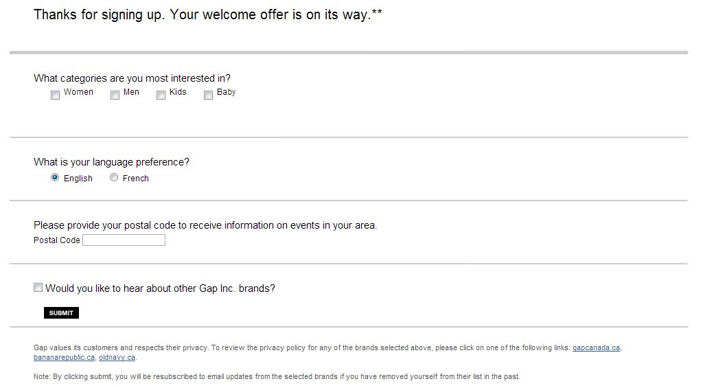
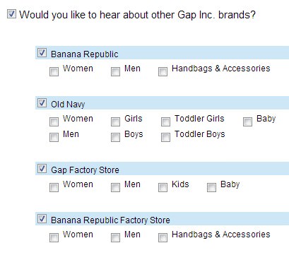
Specific targeted data seems to be a key component in the Gap's email marketing strategy as the next screen I see after I hit the "Sign Up Now" button takes me to a new page to refine who I actually am. They ask me fundamental questions like the categories I'm interested in, my prefered language, my postal code and whether or not I'd be interested in additional offers from the brands. Smart, very smart.
Co-Registration Email Program
I love this idea. And it's something I think more business should try to implement for themselves. Find some non-competitive partners to roll this out with.
This isn't a magic bullet solution to build your list. You're still going to have to work hard to convert these individuals into loyal and raving fans but you've now just been given the chance to.
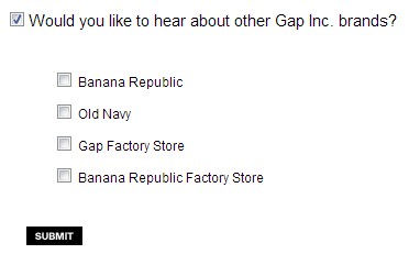
The Gap does this beautifully. And the minute I click on the the "Would you like to hear about other Gap Inc. brands?" option a new series of segmentation questions appear.
The Thank You For Subscribing Page
The Gap, with all it's branding power and team of copywriters let's this page fall flat. I was actually surprised about this. I was expecting a little magic, pizzaz and a splash of colour here - but I was thoroughly disappointed.

Where's the Call to Action?
You read that right...it was tough for me to find the Gap's call to action. They just gave me 15% off my next purchase and I figured there'd be a giant SHOP NOW button somewhere but instead I soon discovered the section below was their call to action...

This non-obvious call to action area is actually clickable. It's a clickable bitmap. That's pretty cool. But this whole section seems like a giant missed opportunity for the Gap.
Email With Images Off
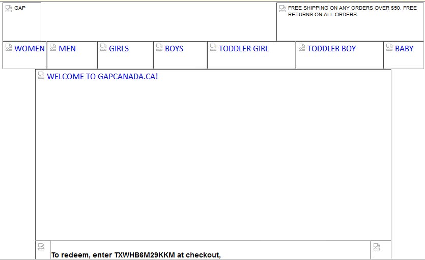
As most email clients show you your messages with images turned off let's see how the Gap's email template worked with the images off. Looking below I think they do an OK job of giving me the gist of what's going on with their email (even though whoever coded it was really fond of CAP LOCKS).
Hey Haven't I Done This Already?
There was another part of the email that I thought was a little bit weird to see. Toward the bottom of the message in deep rivet my eyes to the page blue was a section called "Tell Us What You Want". I clicked on it and was taken to the segmentation page that I already filled out earler...weird.

Email Frequency
There's a frequency sweet spot for every niche. And for me the Gap's frequency of messages was just way to much. Here's a look at my inbox again.

The Key Takeaways
1) Make it easy for people to sign-up to your newsletter
2) Thank and welcome your subscribers
3) Make an irresistible offer
4) Make your emails look good with images off
5) Have strong call to actions and clear places to click
6) Find the frequency sweet spot
7) Gather additional information if you can (after they've subscribed - make this a second step or something to be done later in the cycle)
8) Maximize your thank you page
9) Make Email Marketing and the enticing of new subscribers to your list a priority
10) Make it super-easy for your subscribers to unsubscribe from your newsletter