The minute I saw this email campaign from Levi's I loved it. And I knew I wanted to share it with the MyBizMailer community.
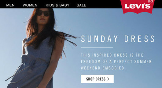
There's an openess, intrigue and a curiosity that's evoked from the blues and care free attitude of the girl in the picture.
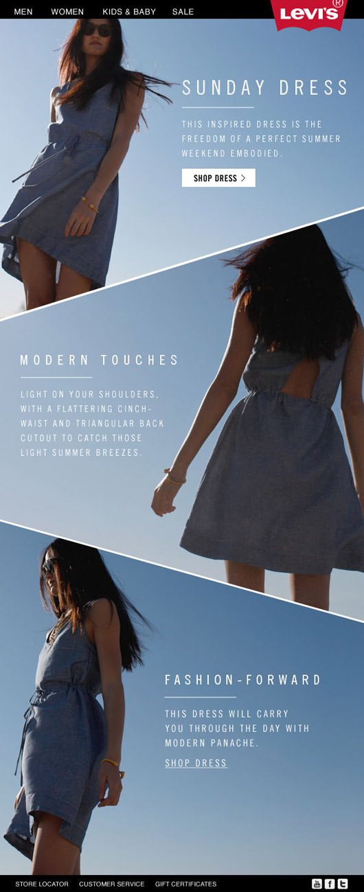
Everything from the colour chosen to the angle panels gently and gracefully draw the eye along on a journey.
Subtly evoking in the reader a desire for more (not necessarily for the dress as I'm a dude and not into that kind of thing) but the sophistication of this campaign blew me away.
One of my favourite elements of this campaign is the angled panel. Just when your brain starts to cool down in interest, its attention is peaked again when the top corner of the next panel comes peaking out the right side of the email.
A clear call to action rivets my eyes to the email.
ANd the Levi's iconic red colour and tab is given the room it needs to do its work.
Tam Houetin the graphic designer who worked on this piece had this to say, "This Sunday Dress has some great styling attributes, including a back triangular cut-out, which can only be seen while viewing the dress from the back. I used a diagonal layout treatment here to not only allude to the back’s triangular cut-out, but also to allow users to discover the different sides of the dress as they scroll down."
