The internet can be one giant rabbit hole. Whisking you away to mystical and magical places.
You innocently go check out a link from an email and the next thing you know you’ve visited a thousand websites, clicked on a million links, watched some videos and end discovering a hidden gem amidst all the rubbish.
That’s how I ended up stumbling upon this little gem:
"Every time something really ugly won, it would shock me: giant-size fonts for links, plain-text links vs. pretty ‘Donate’ buttons. Eventually we got to thinking, ‘How could we make things even less attractive?’ That’s how we arrived at the ugly yellow highlighting on the sections we wanted to draw people’s eye to."
That quote's from Amelia Showalter the Director of Digital Analytics for the Obama Email Marketing Team which raised over $600 Billion via email campaigns.
It got me thinking about the 5 Trends Shaping the Next Year of Email Marketing that we released at the start of the year.
One of our predictions was the rise of the "Pretty Plain Text" styled emails.
What’s a "Pretty Plain Text" style email you ask?
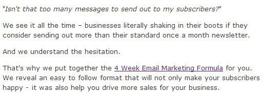
It’s an HTML formatted email that looks like a plain text one but gives you more control over how your text and links are handled.
Here’s an example…

I've personally seen more businesses adopt this type of approach over the last couple of months when sending out their email campaigns. It's simple, and makes the subscriber feel like they're having a one-to-one conversation with the sender (corporate lingo doesn't work well with this approach).
So as you start to rollout your spring specials this may be the perfect time to test the waters with Ugly Emails.
Choose a "One Mission Per Message" approach and start to draft up a “Pretty Plain Text” version of your fancy campaigns.
You never know – the results may surprise you.
Hope you're having a great week!
The MyBizMailer Team
P.S. Our WYSIWYG and Drag & Drop Editor make creating emails super-easy. Check out our new pricing plans.