We're all looking for ways to maximize the impact our newsletters get.
I wanted to share some very interesting data from a recent eyetracking study done on newsletters.
First some interesting facts:
• The average time subscribers spent reading a newsletter after opening it was 51 seconds
• Subscribers don’t actually read newsletters – they scan them
• When they do read a newsletter they only read about 19% of it
• 35% of the time subscribers only skim part of the newsletter
• 67% of subscribers do not read the introductory sentences
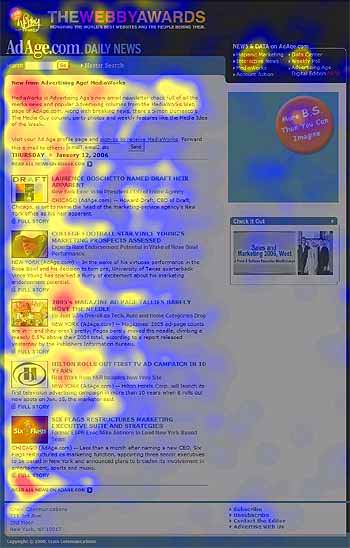
Eyetracking Heatmap

Eyetracking heatmap of users reading a newsletter. Notice the emphasis on reading the first two words of the headlines. The areas where users looked the most are colored red; the yellow areas indicate fewer views, followed by the least-viewed blue areas.
5 Ways You Can Use This Information Right Now
1) Make your emails scannable.
2) Ditch the ten sentence paragraphs.
3) Give your readers focal points.
4) Make your headlines compelling.
5) And make each sentence count.
We're all bombarded with emails. Some recent stats say that the average office worker receives anywhere from 40-100 emails per day. I received 10 in the last 5 minutes.
As email marketers we've got to do everything that we can to stand out, earn attention and maximize on those 51 seconds when we're blessed to get them from our subscribers.
Look over the info above again and then compare it to how you're designing your newsletters and campaigns.
We hope you're having a great week!
The MyBizMailer Team
P.S. Not happy with your current email marketing platform? We'd love for you to join us. Click here to check out our pricing and packages.